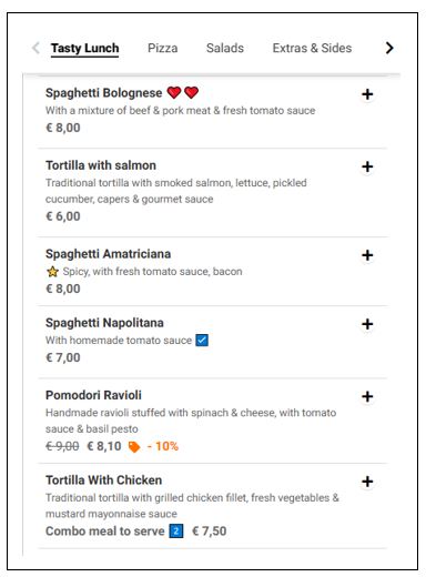
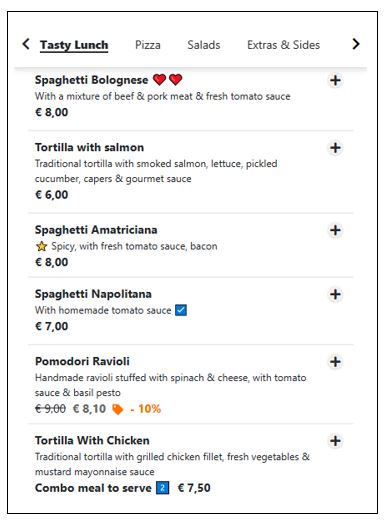
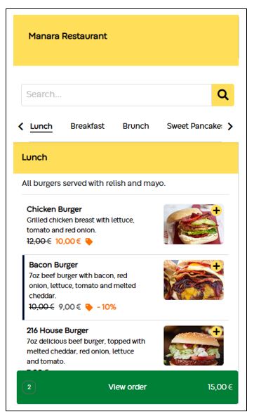
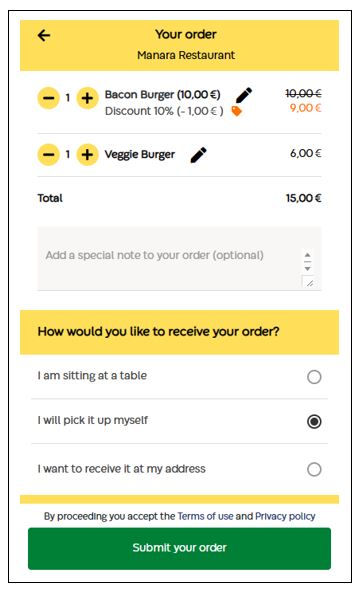
Colors and fonts are crucial to your brand’s identity because they evoke specific emotions and convey key messages. They create visual consistency and recognition, helping customers differentiate and remember your brand. Carefully chosen colors and fonts establish a brand’s personality, build trust, and enhance brand recall.
GonnaOrder’s branding settings enable you to choose the fonts and colors used across the customer menu. A custom color selection gives your store a unique look. You will be able to select from a variety of fonts and unlimited color combinations.

On This Page
- Set Custom Fonts for Your Store
- Select Custom Colors for Your Store
- Things To Consider When Selecting Custom Colors
Set Custom Fonts for Your Store
The standard GonnaOrder theme uses fixed fonts for all stores. However, we offer alternative fonts through the branding settings, enabling you to customize and give a unique feel to your store.
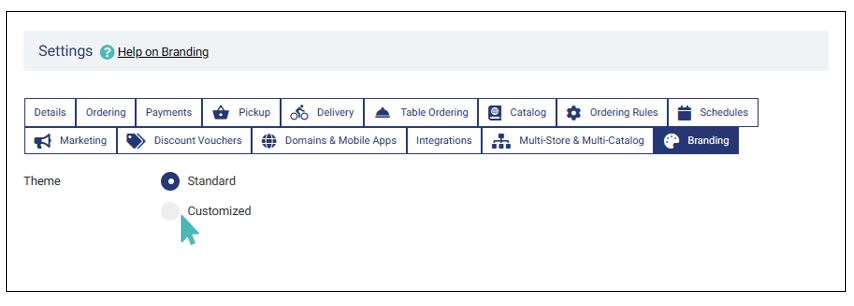
To use custom fonts, go to Settings >Branding and select the custom theme option.
Select Primary and Secondary Fonts for Your Store
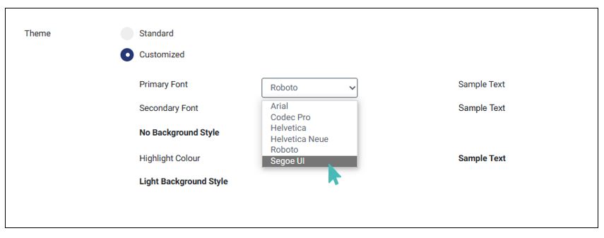
The primary font is used across your store menu for categories, items, options, and price variant names and descriptions. It is also used for all other text that appears on the customer menu and checkout pages.
A secondary font is a fallback option that is only used if the customer’s browser or device does not support the primary color. It should always be different from the primary font.
GonnaOrder supports six alternative fonts that you can use in your store. These are:
- Roboto
- Arial
- Helvetica
- Helvetica Neue
- Segoe UI
- Codec Pro
Roboto and Arial are GonnaOrder’s preferred primary and secondary fonts respectively. They are used for all stores using the standard theme.
You can change your store font by opening the dropdown list next to the primary/secondary font label and selecting your preferred option.
Select Custom Colors for Your Store
Colors can impact appetite, mood, and the time customers spend on your website. For example, according to the psychology of color and food, yellow stimulates energy and appetite, while red increases excitement and heart rate. Green color can signify healthy meals and is associated with vegan and vegetarian establishments. A perfect color scheme is neither too dull and boring nor too bright to withstand.
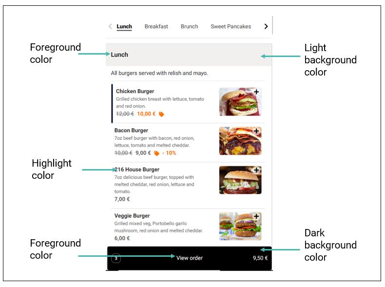
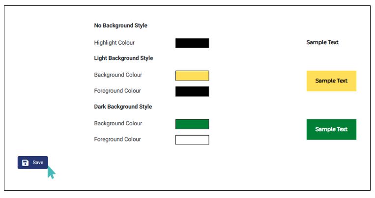
The standard and customized GonnaOrder themes for the store menu comprise three color components.
- The highlight color is used for all items that are highlighted in bold such as item names and order items.
- A light background is used as a background color mainly for the store header (if logo and cover image are not added), category, and section dividers. The corresponding foreground color should be clearly visible on the light background since it is used for the text displayed over the light background color.
- A dark background that is used for action buttons, e.g., the order and payment buttons. The corresponding foreground color must contrast well with the dark background to ensure the button text is visible and readable.
The GonnaOrder standard theme uses a combination of black, light grey, and white. The light grey color is used as a light background with a black foreground color and black is used for the dark background with a white foreground. The black color is also used as the highlight color throughout the store.
Setting Custom Colors
To select custom colors, open branding settings and click on the color bar for the item you would like to change. For example, to change the highlight color, you would click on the color bar next to the respective label. The color bar opens a color selection panel where you can manually pick a color or enter the Hex code, HSLA, or RGBA values for the color you want to use.
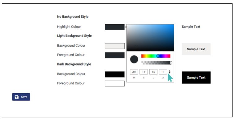
Every time you select a color, the provided samples will update to show the new selection. The examples serve to show you what your store labels will look like when you save your changes. They can also help decide the best color combinations for the light and dark background and their corresponding foreground colors.
After selecting all the required colors, you must click the save button for the changes to apply to your store. If you skip the save button and navigate to other sections of your store then the changes will not apply and your store will use the default theme.
Also, notice that GonnaOrder does not save any themes you may have previously used. As such, it is best for you to save and remember your custom color palettes.
Things To Consider When Selecting Custom Colors
Here are a few things you should consider when selecting custom colors for your store:
Brand identity consistency
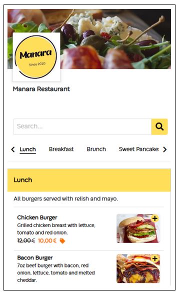
Your custom colors should align with your brand identity. For example, you are better placed using the primary color of your logo as the light background color for your store than using a completely different color. While at it, ensure that the color of your logo is appealing to the eye.
Color contrast between the background color and the foreground color
For both the light background and the dark background colors, corresponding foregrounds are configured. You must ensure that the foreground color selected is both visible and readable. You can confirm through the provided samples before saving your theme.
Select a suitable highlight color
The highlight color is primarily used for the text in the menu. It should essentially contrast well with the light background color.
Color Palette Generators
You can use any of these color palette generators to find the best color scheme for your store. Notice that a palette may contain two, three, or more colors and it is for you to choose which colors to use and which to ignore.
