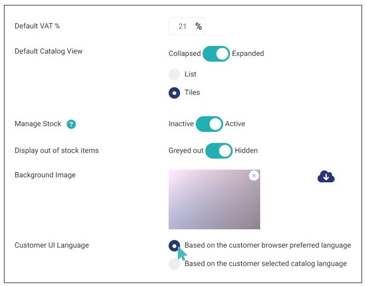
GonnaOrder enables you to change some configuration settings for your catalog setup and display. You will find this under Settings> Catalog in your store.
On This Page
- Set up Default Store VAT
- Change the Default Catalog View
- Stock Management
- Display Out of Stock Items
- Set or Update Catalog Background Image
- Prefered Language for the Catalog
Set up Default Store VAT
GonnaOrder allows you to set up the default VAT rates used in the jurisdiction within which your business operates. The default VAT is usually a numeric value representing the percentage of the product value that goes into taxes. You don’t need to set the VAT value, but in some cases, it is a legal requirement that you show tax information to your customers.
Further, GonnaOrder internally uses the VAT information to improve the store statistics. When set, the default store VAT rates and amounts will be included in the order pdf sent to your customers via email and which you can also download from your administration dashboard.
The details about how to set up VAT for your store and products are expounded on this help page.
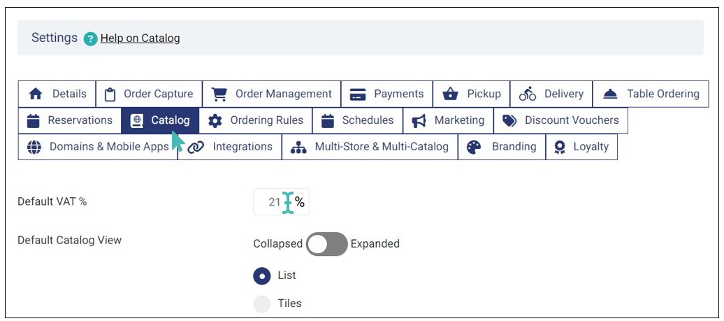
Change the Default Catalog View
As a store manager, you can choose how customers see your catalog. GonnaOrder has two types of catalog views; Expanded and Collapsed views. An expanded catalog view is an excellent option for stores with few categories and items. On the other hand, you may want to switch to the collapsed catalog view if you have many categories.
To switch between these settings, navigate to Settings section and then to the Catalog tab. You will find the setting to change the default catalog view to either expanded or collapsed.
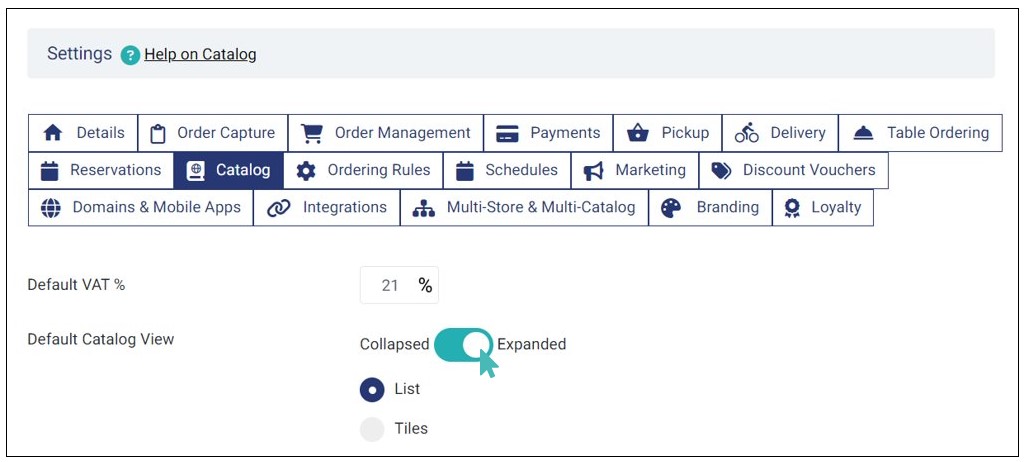
The catalog is displayed in the expanded view by default. This means that when the customers view your store menu, they will see all the menu items listed one after the other and scroll on their devices to browse to the following category. This setting is best, especially for smaller catalogs, because it is easy for the user to scroll among the categories and browse what is available.
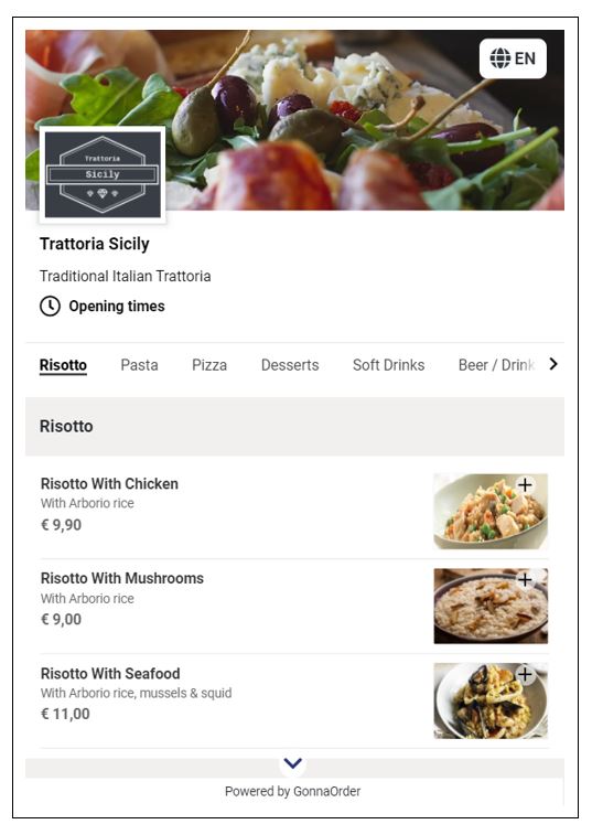
The alternative option is for the catalog default view setting to be in a collapsed view. This means that the customers view a list of all their categories available. To view what items are available under each category, users need to click on the (+) sign or category name to expand. This setting fits well for stores that have long catalogs. The advantage is that the user would first choose more quickly a category that is towards the end of the catalog without the need to browse through all items of the previous categories
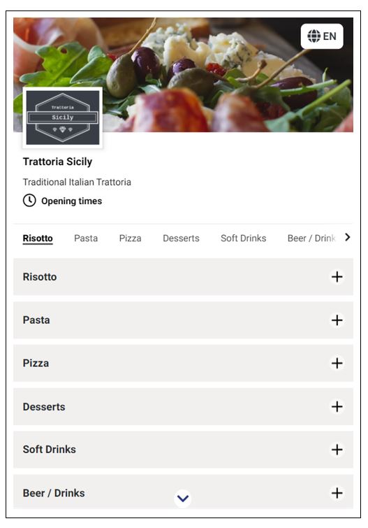
Store managers and owners can choose which view mode to use. The general recommendation is to switch to the Collapsed mode for longer catalogs.
Set Your Catalog View as List or Tiles
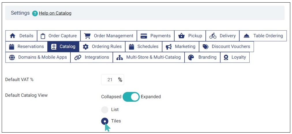
In addition to setting your catalog as expanded or collapsed, you can also choose how it appears on the customers’ menu, either as list or tiles.
For new stores, the default catalog view is set as list. This option is ideal if most of your customers use mobile and desktop devices to place orders. To select this view, choose the list option on default catalog view section.

When you choose the list option, customers view the menu as a list.
On the other hand, you can set tiles as the default catalog view. This changes the catalog view to kiosk mode.
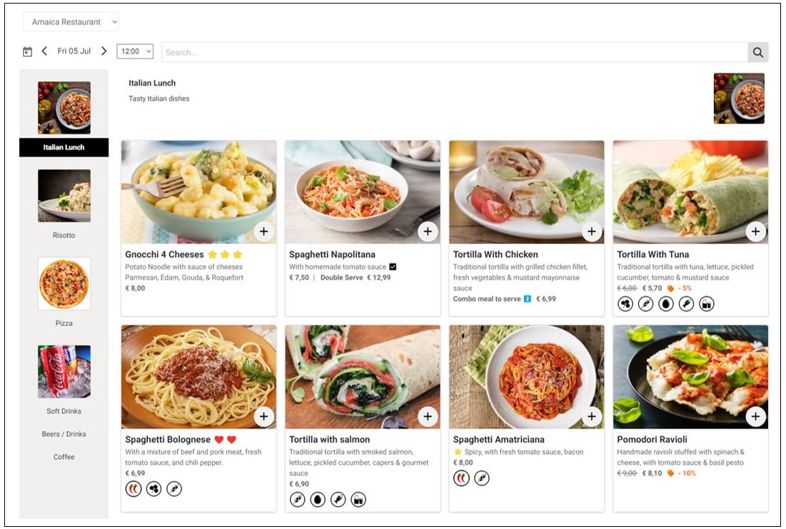
By setting this view, desktop users will view your catalog with categories and their respective images (if uploaded) on the left while the items are displayed on the right.
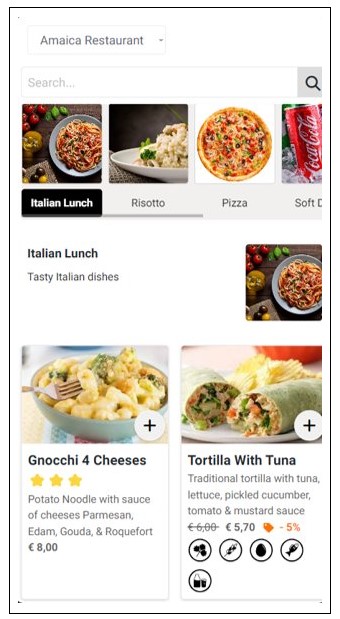
In the mobile view, the categories and their respective images appear on top (just below the search bar) while the items appear below the category. Customers can click a specific category to quickly view the items in that category or simply scroll down to find items in different categories.
Stock Management
As a store owner, you may want to control the stock of a particular item in the store and only accept new orders when such an item is in stock. The stock management feature allows you to record and track available products. Once stock management is enabled, GonnaOrder will ensure you do not receive more orders than the items you have in stock. Stock management is an item level of management that is applied through editing an item already present in the store. It is also applicable to options in an option group and is activated in the same way.
To activate stock management, navigate to the Settings > Catalog. While on this page, you can activate or deactivate stock management by toggling the Manage Stock button to Active or Inactive as needed.
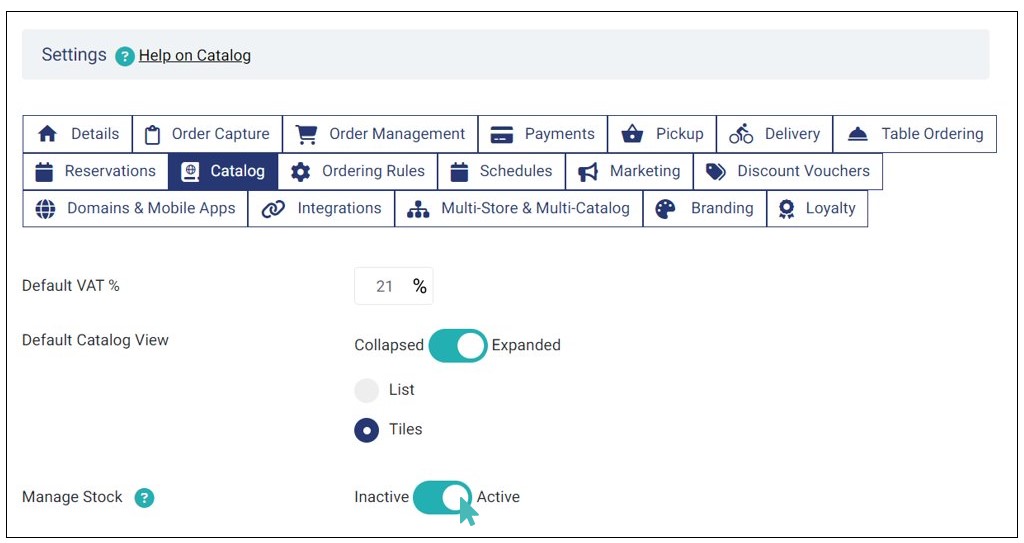
By default, the stock management feature is inactive. When the manage stock setting is activated for a store, an extra section labeled Stock Check appears in the product edit section. This is illustrated in the Update an item section.
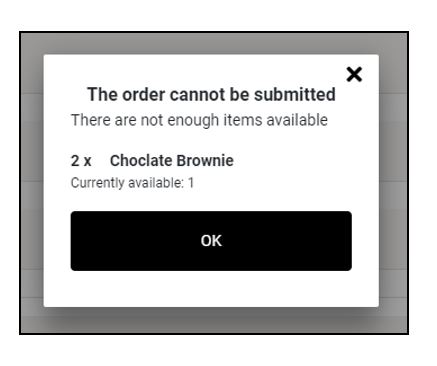
When stock management is enabled, your customers will see an error if they include more items in an order than your store can fulfill at the current time. For this setting to work efficiently, stock check must be enabled for that particular item. Stock features are explained comprehensively under Setup stock features section, and you may want to get a better understanding from there.
Below is the customer interface showing a scenario where a user added two items of the same item to the cart when only one was remaining in the store. It is worth noting that products that are out of stock will not be displayed to customers when a stock check is enabled.
Display Out of Stock Items
GonnaOrder allows store managers to choose how they want to display out-of-stock items. This catalog setting is triggered when the item’s stock level reaches zero.
There are two ways in which you can display the out-of-stock items on the customers’ end:
- Greyed Out Items: Item is visible on the menu but makes the item unclickable, hence customer’s can no longer order items.
- Hidden Items: Item is hidden from the menu.
Store owners can update the stock level as and when required. For more information on how to update the stock, refer to the See more about Set up Stock Features article.
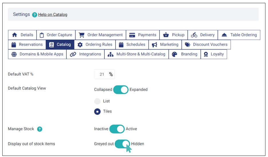
To grey out out-of-stock items go to Settings > Catalog and toggle the display out of stock items option to Greyed Out.
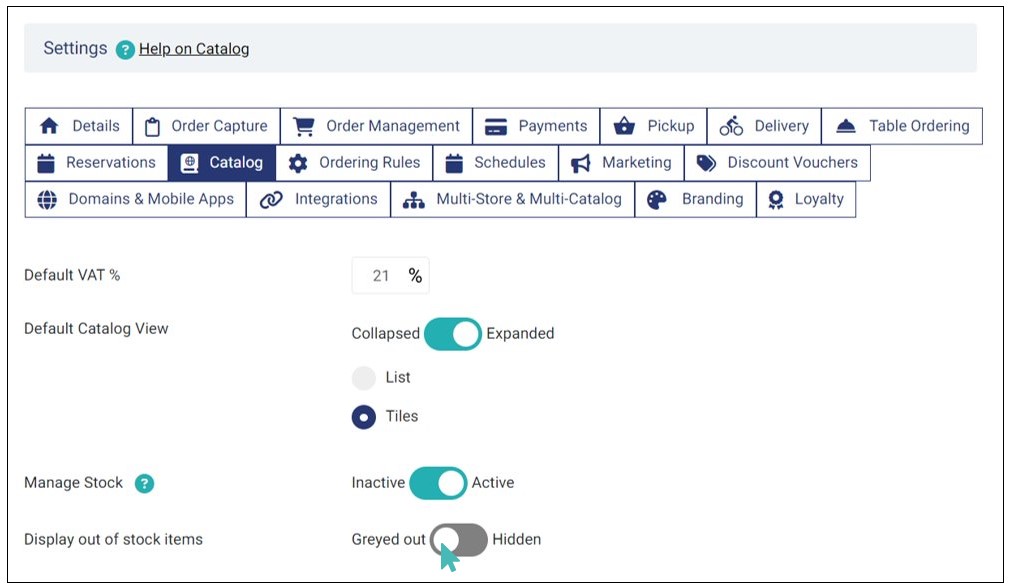
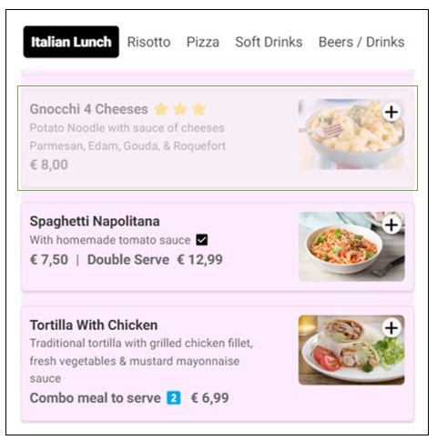
When you activate the grey out option, customers will be able to see the out-of-stock items but cannot order them.
To hide out-of-stock items from customers’ view, go to Settings > Catalog and toggle the display out of stock items setting to hidden.
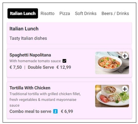
As displayed on the customers’ end, the initially greyed out item (Gnocchi 4 Cheeses) is no longer listed on the customer menu when you opt to hide the out-of-stock items.
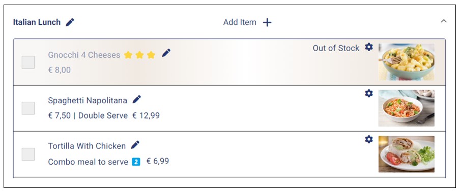
However, as a store manager, you will be able to view the out-of-stock items regardless of the option you choose. Simply go to Catalog and choose the item category to view the items that are no longer in stock.
Set or Update Catalog Background Image
Store managers can set or update the catalog background image through Settings > Catalog. The background image feature should be used to reduce the glaring white space in the catalog. It is especially useful for stores that do not have item images. However, all stores are encouraged to add a background image to their catalogs if necessary.
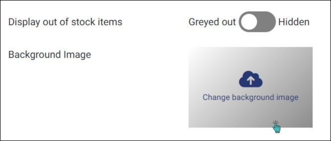
Managers must ensure their preferred background images do not block the catalog content, e.g., item names, descriptions, and prices. You can experiment with multiple images to ensure your customers get the best experience.
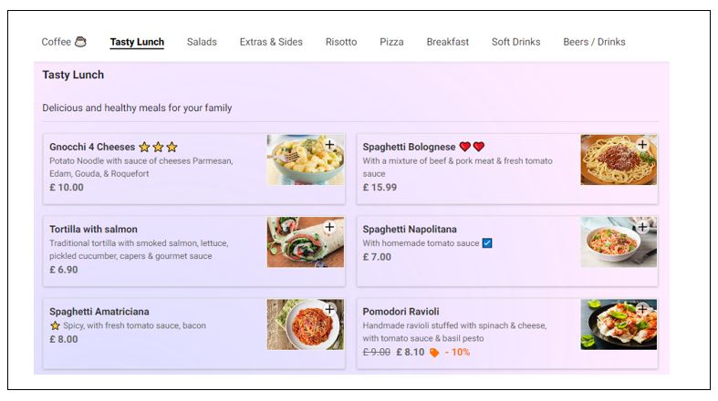
Examples of Images You Can Use for Your Catalog Background
All the text in your catalog has a black color. A dark background would make it difficult for customers to read item names, prices, and descriptions. Therefore, GonnaOrder recommends using a light background image to ensure your menu is readable.
The images below are tested on demo restaurant menus. They offer a clear view of the details without any significant obstruction. You may use any of them in your catalog, or you can experiment with your custom images.
Notice that the size of the image does not matter. GonnaOrder will crop or stretch your image to cover the catalog. Therefore, you can use an image of any size or aspect ratio.


Prefered Language for the Catalog
Admins can configure how the catalog is viewed by customers based on the prefered language settings. Select either of the below options based on the preferences:
For more information on catalog preferred language, refer to the Manage Translations help page.
